Do you want to add testimonials to your crowdfunding platform? Here’s how you can add them via Skhemata components using HTML widget code. You may notice that there are different plans on the Thrinacia pricing page. Included in the scale plan is the ability to use Skhemata components. More information can be found about the Skhemata components here.
One that you can use in particular is the testimonial component. More information and the source code for this particular component can be found here.
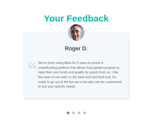
The testimonial component is a basic slider with text and images which can be customised for your scenario. You can see what an example of the testimonial component would look like via the image above.
It requires modifying some simple JSON data and HTML in order to work on the page. You will also need to paste the code via the code view in the page editor. There are areas on Atlas that provide the code view, and these would be the only areas on the site that you can use the components.
Let’s get started!
Step 1 Subscribe to the right plan
First you will need to subscribe to the appropriate subscription plan. As seen on the pricing page, the Scale plan comes with full access to Skhemata components. If you are already subscribed to a plan, you can upgrade/downgrade at any time. Just contact support@thrinacia.com if you want to make the change.
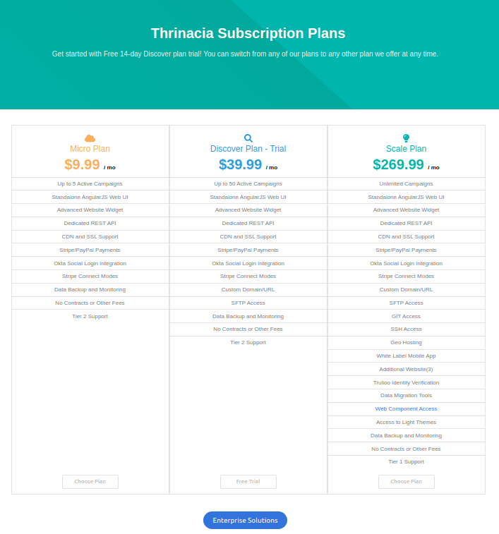
If that plan does not suit your needs, you can always purchase a plan on the Skhemata site here.
Step 2 Adding the component
Now that you have an appropriate plan, you can start adding the testimonial component to a page or area on the platform. To do this, you will need to copy the following HTML code into the HTML editor on your page.
You will notice that when you paste the widget code into your project, it will display default data. You will want to update this data with your own testimonials. To do this, you will need to copy the config-src file. I have an example that you can copy here. Once you’ve copied the code, save it as a JSON file. Below is an example of what the code looks like.
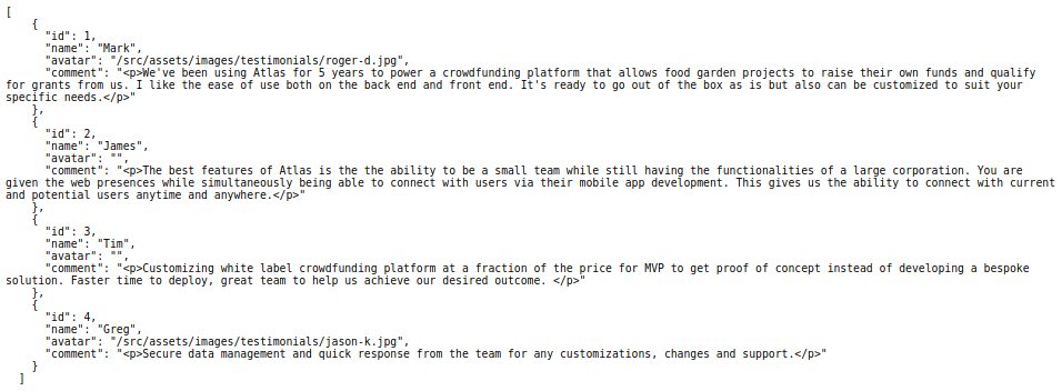
This is the data that is being displayed on the component. You can update the name, comment, and avatar (with a link) to make this feature more customized for your instance. If you want to add an avatar image, you will need to host the image somewhere. This, however, is not all of the customizations you can do to the component, there are other ways you can update it which will be mentioned below.
What you need to do, is host the above JSON file (I used GitHub) somewhere and reference this link in the widget code where it says config-src. You will need to replace the link that is currently added.
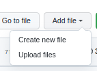
There are a ton of ways you can host the JSON file, but for ease of use, here’s how you can host a file on codepen. Create a new account and a new repository. Once you have an account and a new repository created, you can then upload a new file.
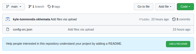
Once you have hosted the JSON file, you will then need to grab the URL to reference it in the widget.
To do this, click on your file in your repo. As you will see, I have named my file config-src.json so I will be clicking on that file.
This is where you are hosting the file. To get the correct link, you will need to append the following at the end of your URL: ?raw=true
Once you have added the above to your URL, copy + paste it into your browser and go to this new URL. This will take you to the raw JSON file that GitHub is hosting for you. You can then copy it. My URL begins with raw as you can see here: https://raw.githubusercontent.com/kyle-tummonds-skhemata/test/main/config-src.json
Now, you can replace the URL for the config-src with your JSON file.

You should see now that the content you have added in the JSON file will display on the widget.
Some additional customization that you can make to the component would be the following:
- You can add custom CSS to target specific elements of the widget to make it look different.
- You can use the HTML attribute to change the way that the component will function. For example, you can see in the widget code that there’s an attribute called ‘interval‘, with a number beside it. You can change that number if you would like the component to scroll through the different testimonials faster or slower than the current speed.
Further customizations may only be possible if you are importing the entire component into your project rather than using the widget method so you can access and modify the source code directly.